Code impact analysis at scale starts with seeing the whole codebase
Contents
- Code visualizations are built from the data a recipe produces.
- Method usage shows the blast radius of a breaking API change.
- Dependency insight shows how far versions have drifted apart.
- Language composition shows what a codebase is actually made of.
- The vulnerability profile shows how hard each security fix will be.
- SQL operation usage shows which applications touch which data.
- COBOL relationships map how mainframe code fits together.
- A dry run shows the full impact of a migration before you make it.
- Prethink visualizations show where code quality risk sits.
- Impact analysis tells a team where to start, and recipes make the change.
Business leaders ask engineering the same questions before any big change. What’s holding back the cloud migration? What will the upgrade cost? How many teams need to be involved? Answering them takes impact analysis: what code has to change, who owns it, and what could break.
Done by hand, a large impact analysis takes experienced developers weeks of digging through code. By the time the analysis is done, it’s out of date. Code visualizations answer the same questions from current data, across every repository at once.
In Moderne, a visualization turns the results of a recipe run into a chart or graph, so teams can see the blast radius of a change before they make it.
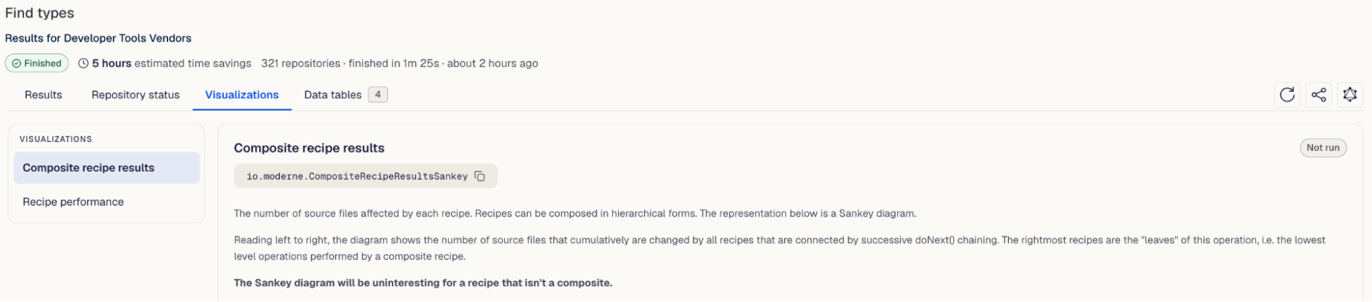
Code visualizations are built from the data a recipe produces.
Every recipe that searches or changes code can also produce data tables, and each visualization is a Jupyter notebook that draws one of those tables. Some are graphs you can zoom into to follow connections. Others are filterable grids you can search.
Teams choose what they want to see, such as API usage, dependencies, database queries, or code quality, and run the recipe that collects it. They can also write a custom recipe that collects the data they need. The sections below walk through the visualizations teams use most for impact analysis.
Method usage shows the blast radius of a breaking API change.
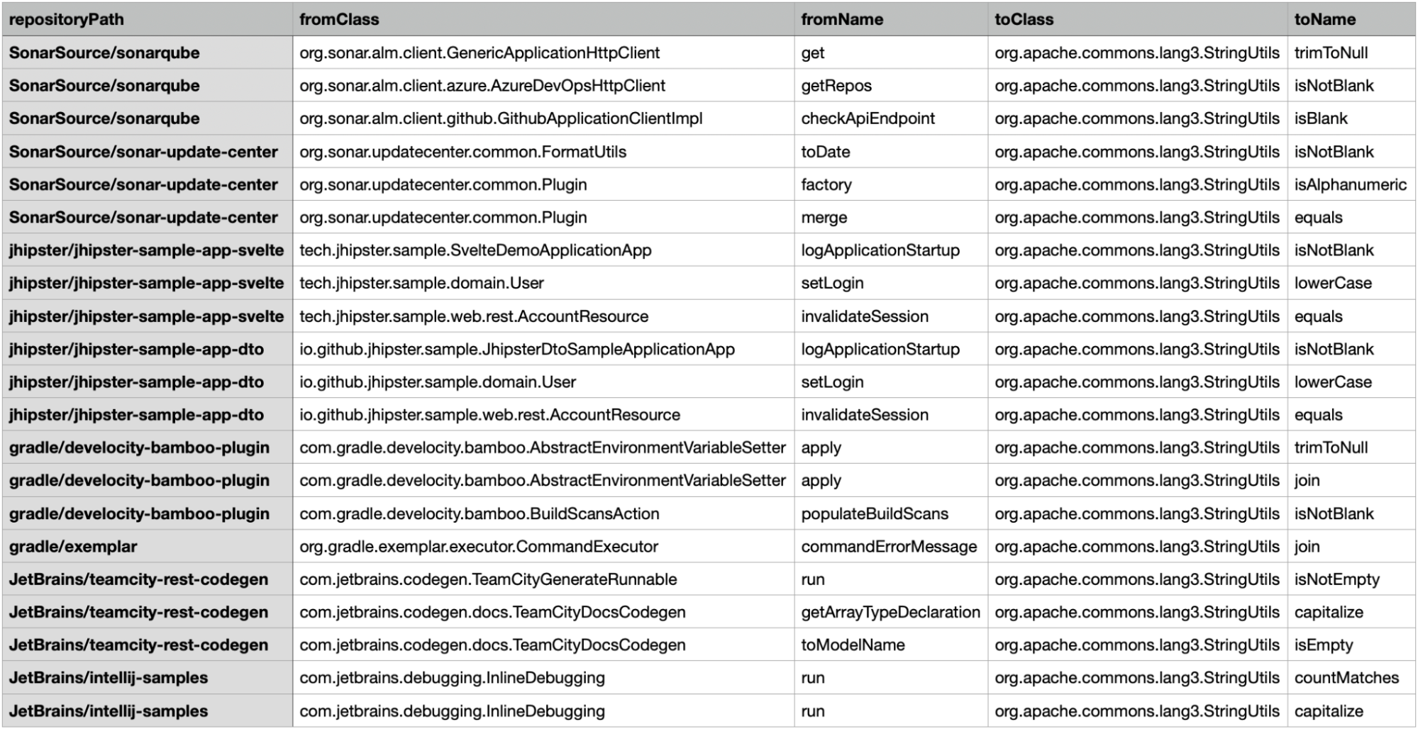
The Find call graph recipe records every method call across all repositories, and filtering to one method shows everywhere a change to it would reach. It includes calls from other libraries and services, and lists them in a data table you can filter by class or method. Because Moderne searches the Lossless Semantic Tree (LST), it also finds uses a text search would miss, such as calls through a subclass.
Without a search like this, a complete answer across many repositories takes too long to get, so teams spot-check and hope nothing breaks. Across 321 open source repositories, filtering that table found 663 calls into Apache Commons Lang’s StringUtils, spread over 29 of them. Each one is a place a breaking change to StringUtils would reach.
With that answer in hand, a team can check for breaking changes during code review and plan for them before merging.
Dependency insight shows how far versions have drifted apart.
The Dependency insight recipe for Gradle and Maven finds every version of a dependency in use, direct and transitive, and draws a violin chart of the spread. Drift matters because one repository upgrades a library and another doesn’t, and an application built from both breaks. Transitive dependencies make it worse, since they don’t show up in a text search of the build files. In this example, each gray shape shows how many repositories run each version of a Jackson artifact. Most are on 2.17.2, and a few still run 2.15.2.
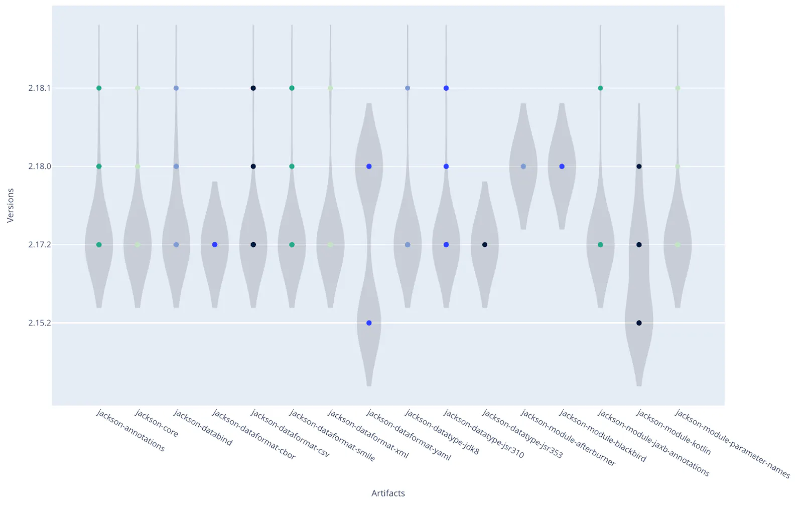
From there, the lagging repositories are the upgrade list. For how teams act on it, see Manage your software dependencies or they will manage you.
Language composition shows what a codebase is actually made of.
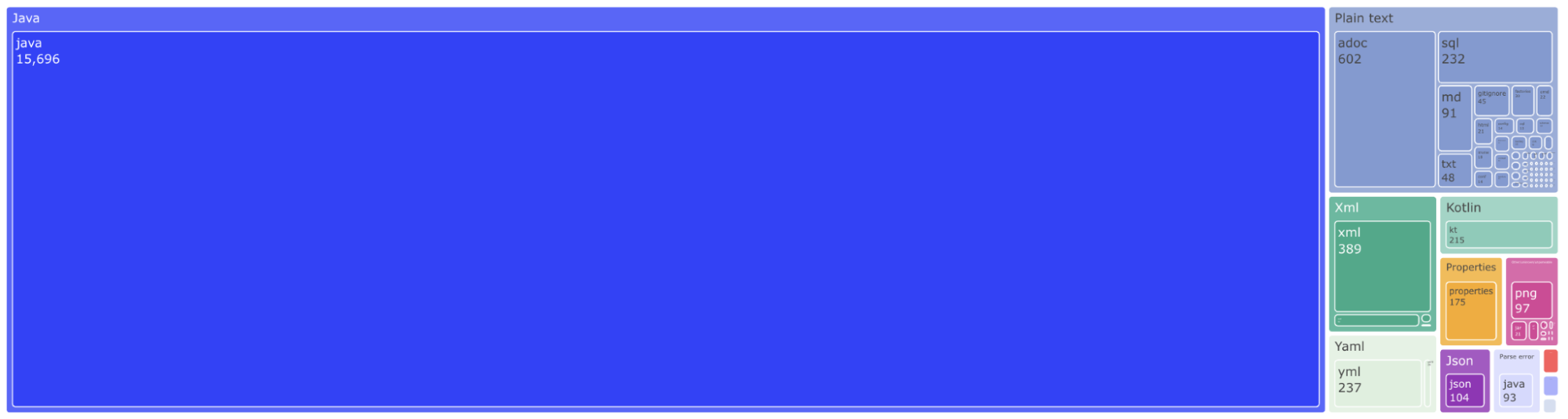
The Language composition report recipe draws a treemap of the languages and file formats in each repository. It shows how much of the codebase is in each language, the starting point for planning around a language that is losing support, upcoming migrations, and hiring.
The vulnerability profile shows how hard each security fix will be.
The Find and fix vulnerable dependencies recipe checks each dependency, direct and transitive, against known vulnerabilities. Its dependency vulnerability profile groups the results by severity and by the size of the upgrade each fix needs: patch, minor, major, or no fix yet.
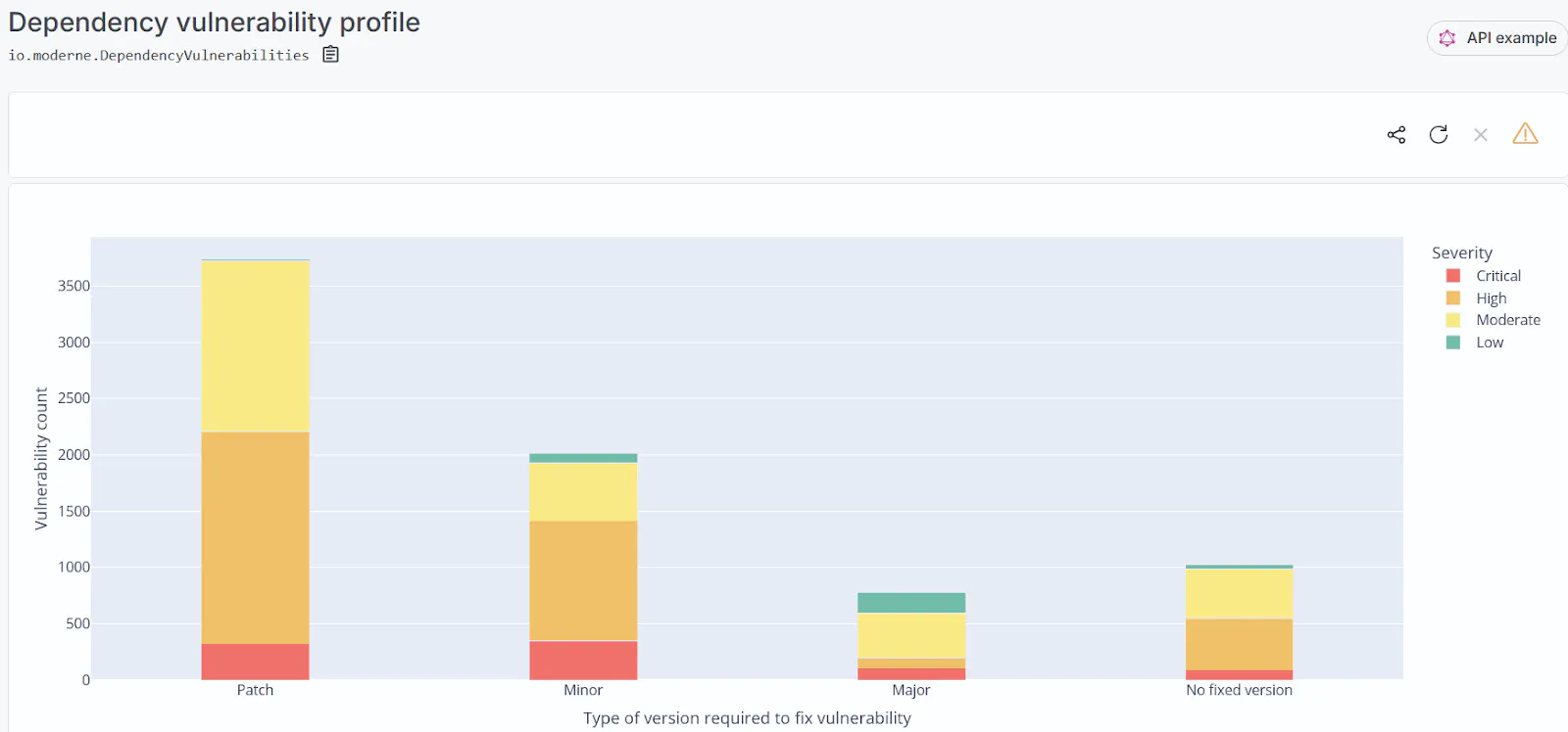
The recipe already makes the patch upgrades, so a team can review those pull requests and commit them across the codebase. The rest of the chart is the plan for the minor and major upgrades that need their own migration recipes.
SQL operation usage shows which applications touch which data.
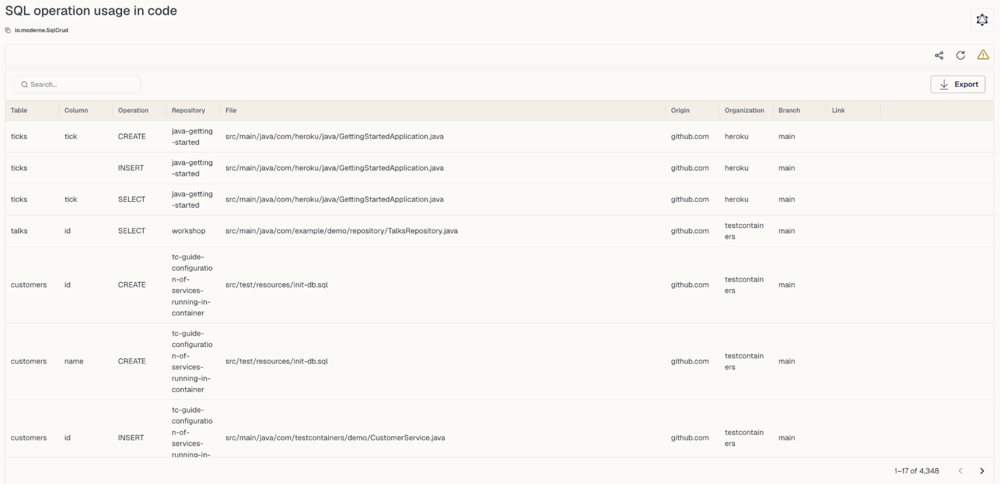
The SQL operation usage grid lists every SQL operation found in code, so a team can see which applications read and write each table before changing a database or a schema. It can be searched and filtered by table, operation, repository, or organization.
COBOL relationships map how mainframe code fits together.
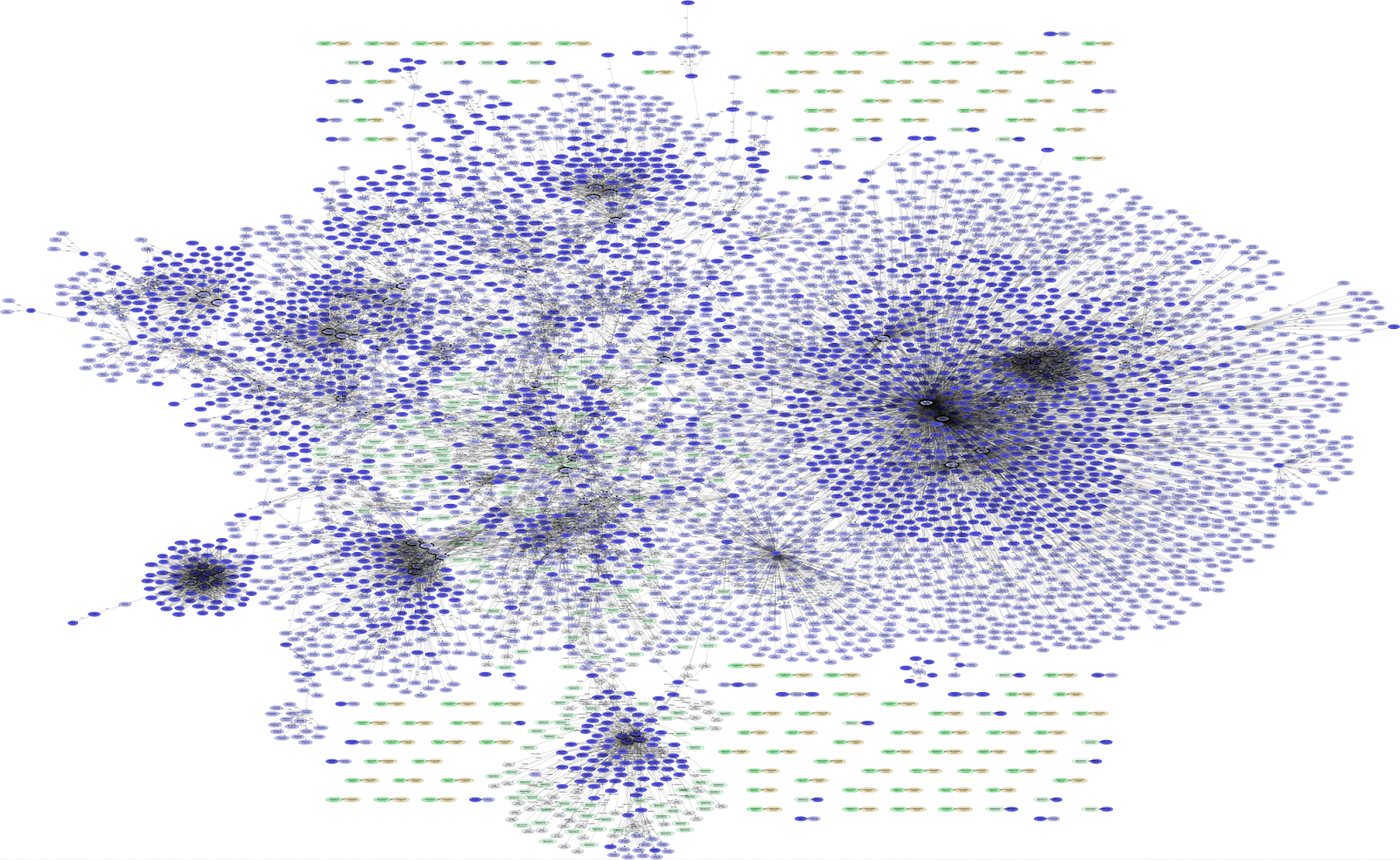
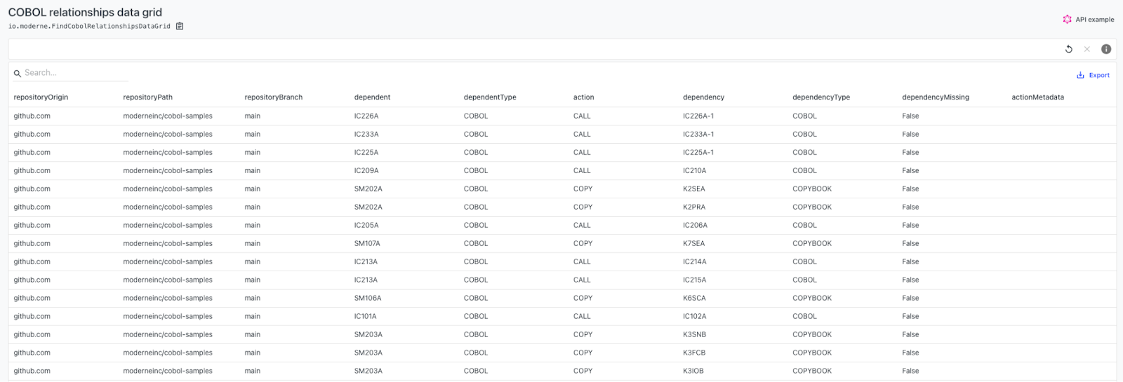
The Find COBOL relationships recipe draws a directed graph of how COBOL programs, copybooks, link-edit cards, and DB2 access connect, with a data grid for the detail. For mainframe teams, it shows what a change would affect in code that is otherwise hard to trace.
A dry run shows the full impact of a migration before you make it.
A large migration is the biggest impact analysis most teams do. A dry run of a migration recipe such as Migrate to Spring Boot 4.0 shows every change the recipe would make, in every repository, before anything is committed. Its data tables show which parts of the migration touch the most code, so a team knows where to look hardest before merging. The Spring Boot 4 migration guide covers the rest of the process.
Prethink visualizations show where code quality risk sits.
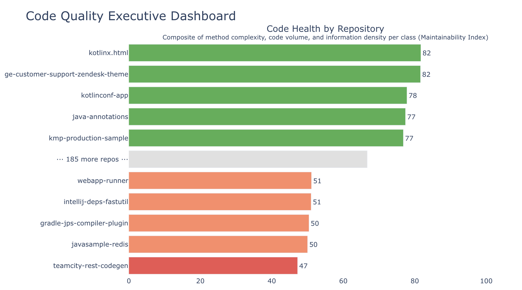
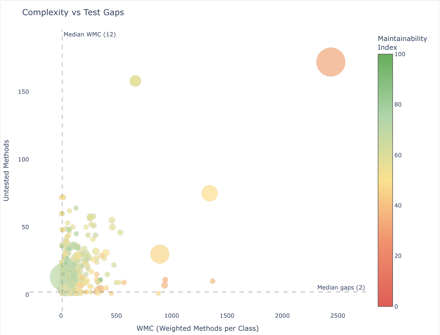
Another set of visualizations comes from Prethink. Running the Update Prethink context recipe computes code quality metrics for each repository and draws them as a set of visualizations:
- A code quality dashboard summarizing health across repositories
- Package dependency cycle graphs
- Complexity plotted against untested methods, to find risky code with no tests
- Class coupling against cohesion, to find classes that should be split
The same metrics are written into each repository, so coding agents can see the risk before they change anything.
Impact analysis tells a team where to start, and recipes make the change.
Visualizations turn a codebase’s structure into something a business leader can read, which makes it easier to get agreement on an upgrade or a cleanup. Once a team knows the impact, the same platform runs the recipes that make the change across those repositories and tracks the rollout in DevCenter. Coding agents can run the same recipes through Moderne and read the resulting data tables, so an agent planning a change starts from the same impact analysis a team would. For a different view of the codebase built on embeddings, see what embeddings are and why they help with code impact analysis.
To see visualizations on open source code, try the Moderne Platform, or book a demo to see them on your own repositories.
Originally published